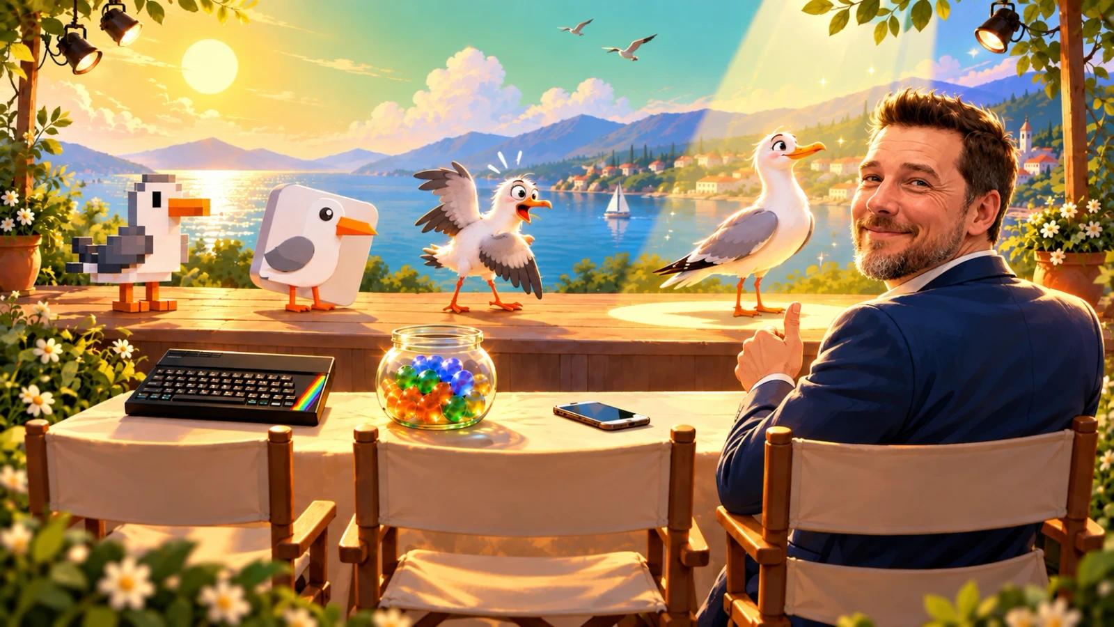
Anthropic released Claude Opus 5.5 on 22 September. The reviews said it performs at the level of Fable 5.1, their most capable model, at less than half the price. I spent a while trying to work out what that meant in practice and ended up on a video by Marcin Teodoru, who tested it by giving one of his existing apps a complete makeover. He was very impressed with the result.
What he didn’t do was hand out the prompts. He talked his way through them, but they weren’t in the comments, and he had switched off the transcript, so you couldn’t copy them out of the captions either.
I have a chore app for my children. Mine Opgaver, “My Tasks”, was on version six and did its job. It also looked like what the prompt I ended up with calls “a basic cookie-cutter AI build”, and I couldn’t really argue with that.
So I did what any reasonable person would do. I found an online tool that pulls the text out of a YouTube video, gave the whole transcript to Claude and asked it to write me a prompt that would do the same for my app. This is what came back:
I want to completely redesign the look and feel of my existing app. Right now, it feels like a basic cookie-cutter AI build. I want it to feel like a highly polished product - imagine Apple designed it. It should feature dynamic movement, interactive rollovers, deep shadows, and slick animations. First, create a new branch on my GitHub for this overhaul. Then, generate five different visual renderings of the new look and feel so I can choose a direction before we start writing any code.
Reading it again, two things stand out. Interactive rollovers, for an app a child uses with a finger on an iPad, where nothing ever rolls over anything. And the GitHub branch, which went straight out, because I don’t use GitHub for this project.
The five designs came back as clickable iPad screens, side by side. Number 3 was called “The Jar”: every finished task drops a glass marble into a jar, and by the evening the whole day is sitting there in glass. I picked it. Except for the colours: number 5’s were far more cheerful, so I asked for number 3 in those. Yellow morning, mint afternoon, blue-lilac evening.
Then there were the birds in the sky behind the tasks. The first ones looked like an icon wobbling. The next ones flapped properly but flew sideways, so they were redrawn in profile. Then I pointed out that a bird that looks half the size is twice as far away and should appear to fly half as fast, and Claude worked out every bird’s speed from its size. The maths is in a comment in the CSS. Finally I asked for them to set off at different times, so they didn’t take off in one clump. For the record, my feedback on the last three rounds was “perfect”, “looks great” and “ABSOLUTELY perfect”, in that order. I’m aware that perfect is not normally something you can improve on.
The old sounds were generated by the app itself and sounded like one of the first games for the ZX Spectrum. The new ones are real recordings from Mixkit, Pixabay and Freesound. The marble lands 0.62 seconds after the tap, so that’s when it clinks. The afternoon rockets burst exactly on the booms in the recording, because Claude measured where the booms are.
Claude also suggested that a tap should skip the celebration. I said no. It would be a shame to brush the screen by accident and miss it.
The five designs arrived at 12:49. Version 8 was finished at 16:29, with 284 automated tests and eight deliberately broken copies of the app to prove the tests would notice. Version 7 was finished at 16:09 and never went live. And in an app whose job is to get children to brush their teeth, nothing got more rounds of notes than the birds in the sky.
Birds aside, I’m properly impressed. For giving an existing app a makeover, Opus 5.5 gets a big thumbs up from me.
If you want to try it on your own app, the prompt is above. I’d leave out the rollovers.